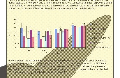
 Oh, look! That huge colored blotch? That's not supposed to be there. At least you can still read the text in this one.
 People come to me and tell me they're sorry they used Powerpoint to make a poster because they know that I "hate Powerpoint". But I don't. That's not the issue at all.
PowerPoint is fine for showing pretty graphics on a data projector. That's what it was designed for. It wasn't designed for making posters and it does a terrible job. The output it produces frequently doesn't print properly.
What I hate is when stuff doesn't work for people. I hate seeing people have to spend hours at crunch time trying to fix problems with their poster that only showed up when they went to print it. I hate seeing people print their poster and only afterwards discover that something horrible went wrong: that all of the symbols have gotten converted into gibberish or one of the pictures is reversed. That's what I hate. Especially when the solution is so simple: just use a competent software package for page-layout. I even support a FREE software package -- that doesn't cause problems like the ones described below -- so cost is not an obstacle.
I know, I know. It's A Different Program and You Already Know Powerpoint. Get over it. I've written a page with hints on how to get started with Scribus. It's installed in the BCRC and I'm right across the hall. All of my junior-year writing students learn how to use it and make posters. It ain't rocket-surgery.
There are other competent page-layout applications too. Adobe makes a couple of really nice ones: Indesign and Illustrator. They're pricey, but they produce excellent output that will actually work when you send it to the printer. And are now free to install on any University-owned computer.
Sometimes, Powerpoint works OK. But way too often, it sends a panicked author back to the computer to spend hours trying to replace graphics or text. And far too often, small errors creep in anyway. Below are just a few of the problems that we've had when people have tried to make posters with Powerpoint.
Powerpoint creates a lot of different kinds of problems. Some are really obvious, but some are very hard to catch unless you check really, really carefully. Sometimes, an object doesn't show up. It's there on the screen when you look at the document, but it disappears in the print preview. That's usually pretty obvious. Sometimes objects or text are reversed. That's a lot less obvious. Sometimes text runs out of the box where it's supposed to stay and runs across the whole poster. Sometimes, you just can't get it to print in portrait. Sometimes it cuts off the edge of the poster. Sometimes random characters are replaced by symbols or vice-versa.
And then sometimes it does things like this:
 Oh, look! That huge colored blotch? That's not supposed to be there. At least you can still read the text in this one.
 That huge colored blotch isn't supposed to be there either. This one is so dark, you can't even see the letters. And see all those lines going every which way? At least this one is really obvious.
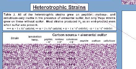 This one also has a few errant lines, but many of the graphics (that are supposed to be bar graphs) got turned into confetti. What's up with that!
  This one looks almost OK -- except for that line that runs out of the graph, continues up through the text and eventually runs off the top of the paper. Aren't you glad we noticed that before we printed it and blew $60? It's the sort of thing that's easy to miss.
 The text is just fine for a while but then the spacing is just all wrong. And then its OK again. This poster got printed because no-one noticed the problem until it was too late. You have to check the previews very, very carefully to pick up a problem like this, buried down in the middle of a paragraph, before you print.
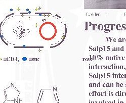
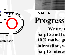 This one is tricky. The print preview is on the left and a screen capture of the open document is on the right. Note the word "rose" which has mysteriously appeared overprinted on the "10%" in the text. We didn't notice this one until after it printed either. When we went back and looked at the document in powerpoint, we realized that "sucrose" had gotten split in two and the "rose" part was way over to the right. But it looks fine in the document. How do you fix stuff like this? You can't make up stuff like this.
I real feel for the student who's just spent a big chunk of money to represent themselves professionally and now they have to stand for hours, being scrutinized by their peers, with an unprofessional poster. Even a small error looks huge once you can see it. Do you point it out to people up front? Or wait for people to find it? What do you tell people to explain it, so it doesn't detract from your message?
Again, in all of these cases, the poster looked fine in Powerpoint. Sometime it even looks right when you make a PDF. Often it was only when we went to print it that we discovered that there was some horrible problem. And sometimes we didn't find the problem until after we had printed it.
So, please consider using a real Page Layout program for Page Layout instead of Powerpoint. I just hate it when things don't work for people.